

Look at enough charts and certain patterns jump right out at you.
Price sits pinned in a narrow range, then snaps upward, holds above, and the moving averages tuck in tight. Point to that spot on any past chart and it went on to rise, every time. "That's it," you think. So I turned it into rules and ran it against historical data exactly as written.
The short version: the pattern that looked flawless to the eye turned out to be almost nothing once I counted them all.
Turning a feeling into rules
First I broke "the feeling of perfect" into precise conditions a machine can count.
Bollinger Bands (80 bars, 2σ) contract → break above the upper band → hold above it → the 5- and 10-day averages converge.
That gave me seven conditions. So far, so good. Moving what looked pretty to the eye into something a computer finds the same way was no problem.
So I counted every single one
The problem is what comes next. Not cherry-picking a handful of pretty setups — I assumed I traded every instance that met the conditions, without exception, and ran it over a long window with fees, transaction tax, and slippage all included.
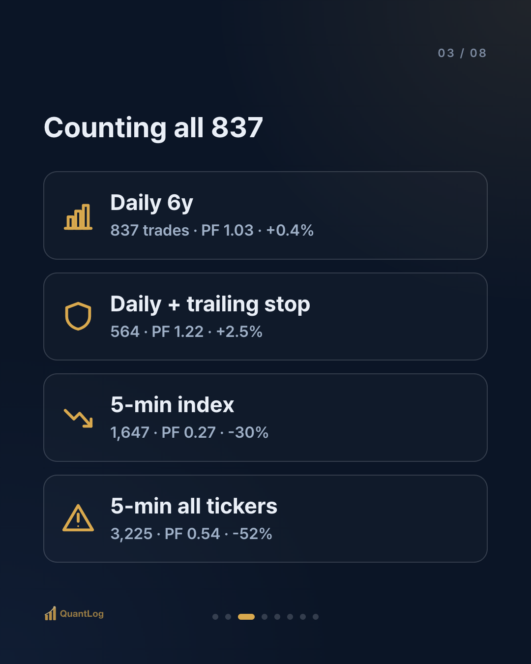
| Test condition | Trades | Win rate | Profit factor | Annual return |
|---|---|---|---|---|
| Daily (a major index, S&P 500, 6y) | 837 | 29.5% | 1.03 | +0.4% |
| Daily + trailing stop | 564 | 30.5% | 1.22 | +2.5% (MDD -31%) |
| 5-min (a major index) | 1,647 | 20.8% | 0.27 | -30% |
| 5-min (all ~2,600 tickers) | 3,225 | 24.1% | 0.54 | -52% |
Profit factor is money won divided by money lost. 1.0 is break-even; below 1.0 is a loss. The daily result, counting all 837, came to a profit factor of 1.03 and +0.4% a year — essentially break-even, the cost of commissions. Narrow the timeframe to 5-minute bars and the profit factor collapses to 0.27, with -30% a year.
The pattern that looked perfect to the eye, once you count them all, had no edge.
I tried three improvements
Not ready to give up, I bolted on three common improvements.
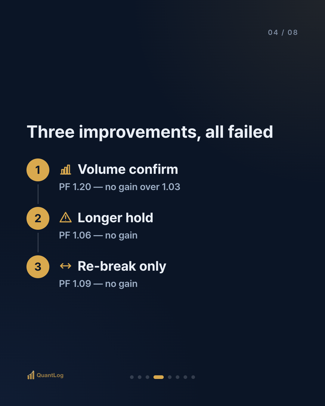
- ① Confirm with volume — only breakouts on a volume spike: profit factor 1.20
- ② Extend the hold — only names that held above longer: profit factor 1.06
- ③ Re-break only — only setups that dipped and broke out again: profit factor 1.09
None meaningfully beat the original (1.03). Why?
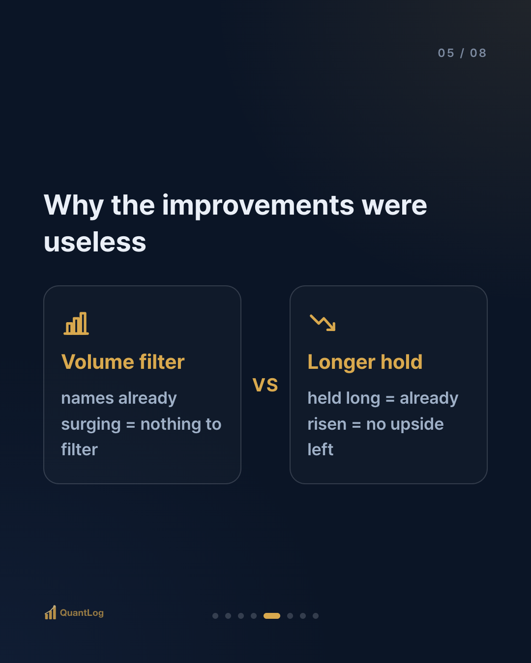
- Why the volume filter is useless: names that hit this pattern are already surging, so volume is elevated by default. There's nothing left to filter.
- Why extending the hold is useless: names that held a long time have already risen a lot, so by the time I enter there's little upside left.
In other words, the "improvements" were really filters for picking stocks that had already risen — a more precise way to get in late.
What this teaches — survivorship bias
The real reason the pattern looked perfect is that we were only ever looking at the ones that worked.

In WWII, some wanted to reinforce returning bombers where the bullet holes clustered. A statistician stopped them: "Reinforce where there are no holes. The planes hit there never made it back." We only ever see the planes that survived.
Charts are the same. Scan a past chart for this pattern and your eye goes first to what rose sharply. The hundreds that had the identical shape but fell instead have already vanished from view. That's why the question isn't "does it look plausible?" but "what happens when you count them all?"
So was this a failed experiment?
No. The backtest did exactly its job.
The purpose of a good backtest is less about finding a strategy that makes money and more about filtering out the ones that don't — before you put real money in. Judging by eye, I might have staked an account on this pattern with confidence. Because I counted all 837, I could stop before funding it.
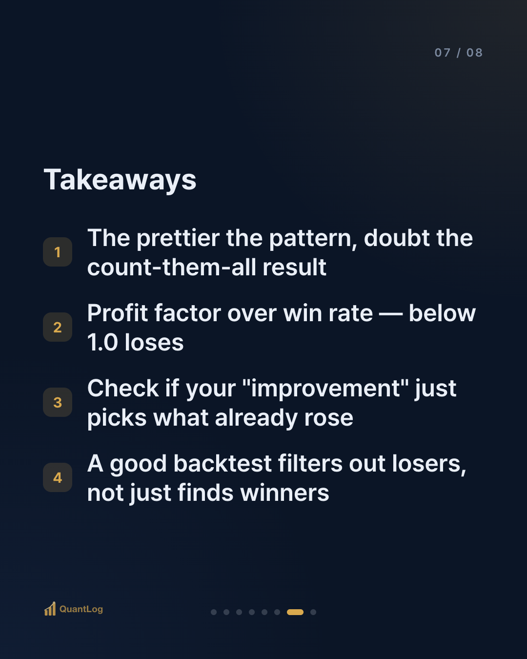
- The prettier the pattern, the more you doubt the count-them-all result
- Watch the profit factor, not just the win rate (below 1.0 loses even with many wins)
- Check whether your "improvement" is really just picking what already rose
- Ask whether what you're seeing is only the planes that came back

Disclaimer
This article is for informational purposes only and is not investment advice. It is not a recommendation to buy or sell any security. All investment decisions are your own responsibility.

Comments 0
Be the first to comment.